

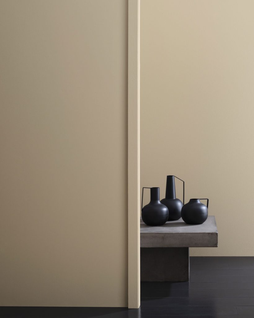
Previously we’ve talked about light neutrals, but often, a little more depth is required to make an impression that shows up through the natural shadows of a space. We’ve put together the top 10 Benjamin Moore mid-toned neutral colors; the goldilocks of neutrals if you will, not too light and not too dark! Whether it’s for throughout the home or a singular room, there are ten perfect choices for any every space.
HC-80 Bleeker Beige – A medium buff hue with pleasing gray undertones.
- LRV 51.66
- Collection: Historical Colors
The warmest of the medium toned neutrals, is HC-80 Bleeker Beige. While it can be considered a taupey beige, it carries a hint of gray to create a soft, subtle beige. This pairs well with creams and off whites, as well as warmer, more traditional colors like reds, olives and burnt oranges. It’s also a color that backdrops mahogany or reddish undertone wood furniture well!
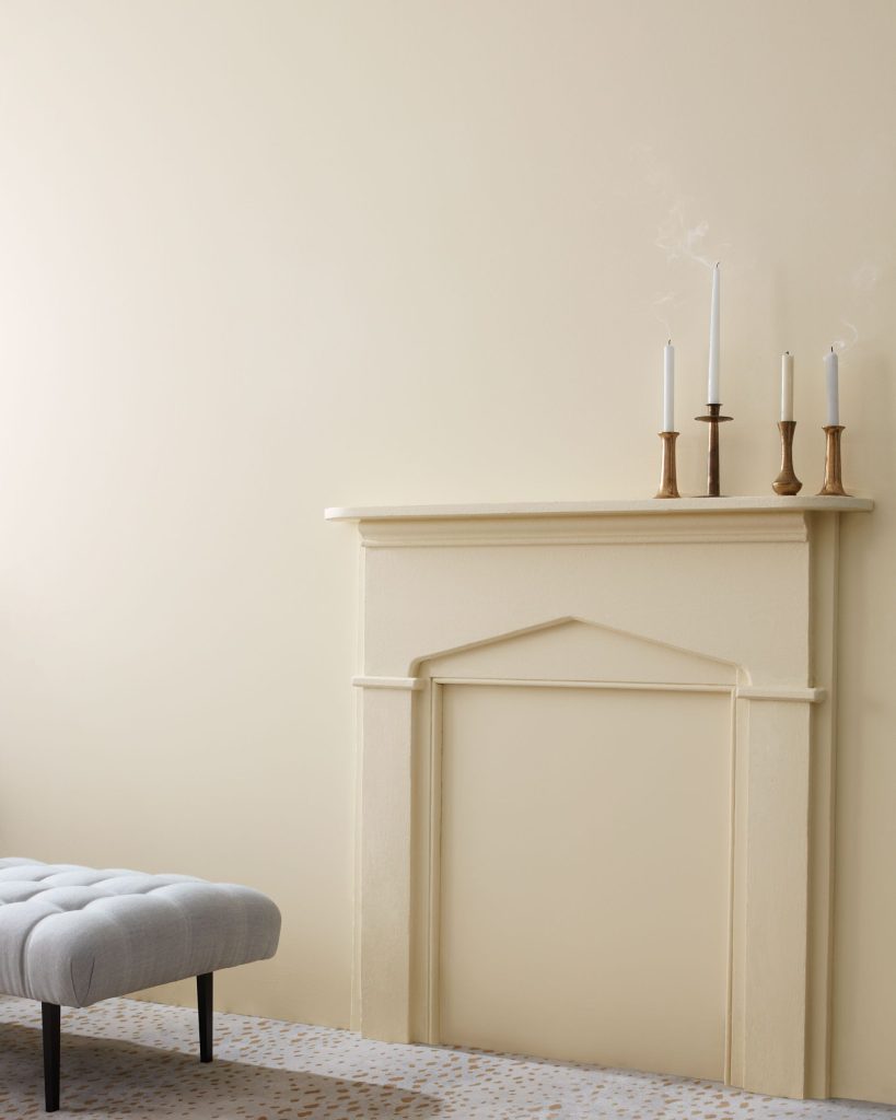
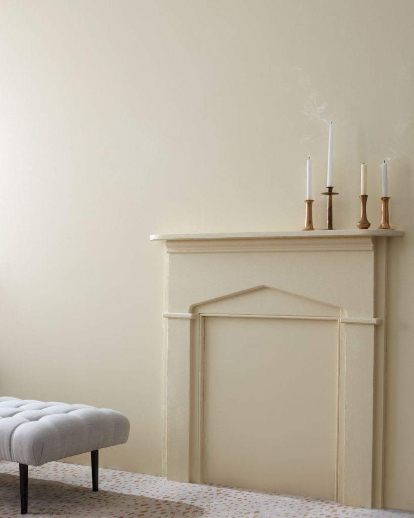
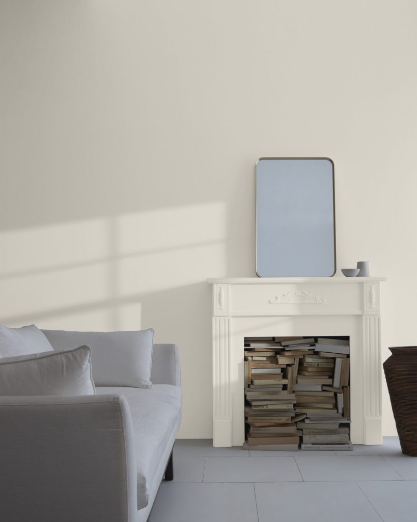
OC-15 Baby Fawn – A go-to neutral that can refresh a space, while providing a warm, welcoming feeling.
- LRV 63.09
- Collection: Off White Colors
- Also Known As: HC-173, 972
OC-15 Baby Fawn and HC-173 Edgecomb Gray are one in the same! This historical color also found in the off-whites, is adeptly placed in both. It’s one of the darkest off-whites you’ll find in the off-white section, but maintains a light-to-medium tone within the historical colors. Truer to the name OC-15 Baby Fawn, in my opinion, is an ever so slightly flesh-pink tone you’d expect to see from a baby fawn indeed! It’s a highly versatile greige; a soft, milky beige, that creates a blend of warmth and familiarity. These factors lend it to be a popular resale home color.
Enjoy Free Shipping On Orders Over $35, Throughout The US & Canada
Get Benjamin Moore Paints Delivered Right To Your Door.
Shop Now
CC-490 Stone Hearth – With its hint of warmth, this stony gray can bring surprising depth and texture to a space.
- LRV 48.75
- Collection: Designer Classics
- Also Known As: 984
CC-490 Stone Hearth is a slightly darker neutral that leans a little toward the beige side. Having said that, light direction, and the amount of light in a space can affect this color significantly. In Northern or Eastern facing rooms, it may draw on the gray side of the color, whereas Southern or Western facing rooms will highlight the warm beige undertone. Conversely, lots of light will showcase a mid-tone depth, where the color can become significantly darker in minimally lit spaces. This medium tone neutral is an ideal backdrop for muted shades, of all color spectrums, as it doesn’t lean too heavily toward a green or red undertone.
HC-172 Revere Pewter – An iconic neutral that provides a versatile bridge between warm and cool tones.
- LRV 55.05
- Collection: Historical Colors, Colors for Vinyl
- Also Known As: 973
For the longest time, HC-172 Revere Pewter has been Benjamin Moore’s most popular color! It’s a tried and true neutral to the core. It’s a perfect blend of beige and gray, to create a ‘greige’. With a slight green undertone (if any), it pairs well with traditional browns and warm tones, but also just as well with warm grays. The blend of different colors in this hue, allow it to go grayer in cooler lighting, but picks up the warmth in warmer lighting.
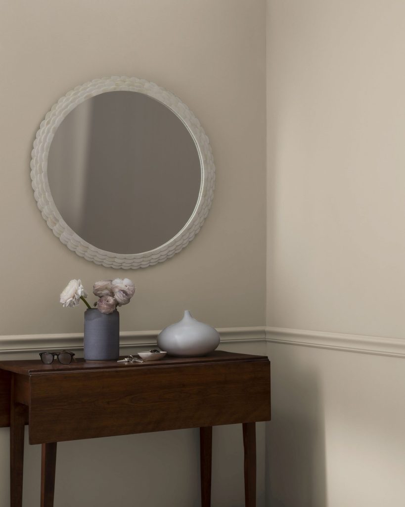
OC-28 Collingwood – A widely appealing shade of gray with lightly cool undertones.
- LRV 61.52
- Collection: Off White Colors
- Also Known As: 859
Also part of the off-whites, this transitional greige, leans to the lighter and grayer scale of the neutrals. With a fairly neutral undertone as well, it makes for a versatile color for throughout the home. It compliments the in-trend grays, while maintaining a good balance with more traditional dark brown furniture. It’s a friendly and elegant shade of gray that feels inviting yet fresh in many spaces.
Enjoy Free Shipping On Orders Over $35, Throughout The US & Canada
Get Benjamin Moore Paints Delivered Right To Your Door.
Shop Now
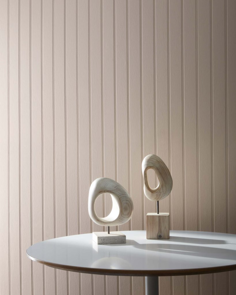
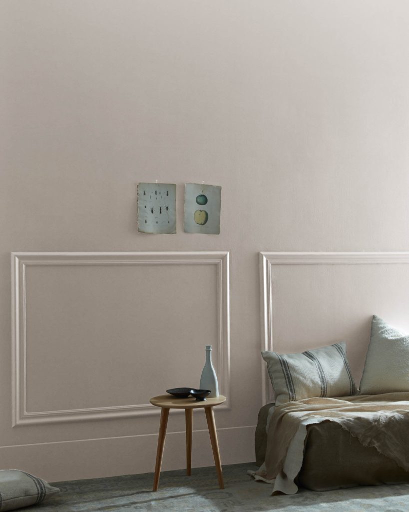
CC-394 Boulevard – A moody gray warmed by a touch of mauve.
- LRV 48.88
- Collection: Designer Classics
- Also Known As: 1005, AC-38
One of my favourite neutrals that falls under a greige, is the CC-394 Boulevard. It has a slight pink undertone with a dash of yellow that creates a modest mix! This creamy gray pairs well with other neutrals and stronger pops of color. Whether its furniture or accessories that are dark, light or even metallic, it gracefully backdrops many different hues.
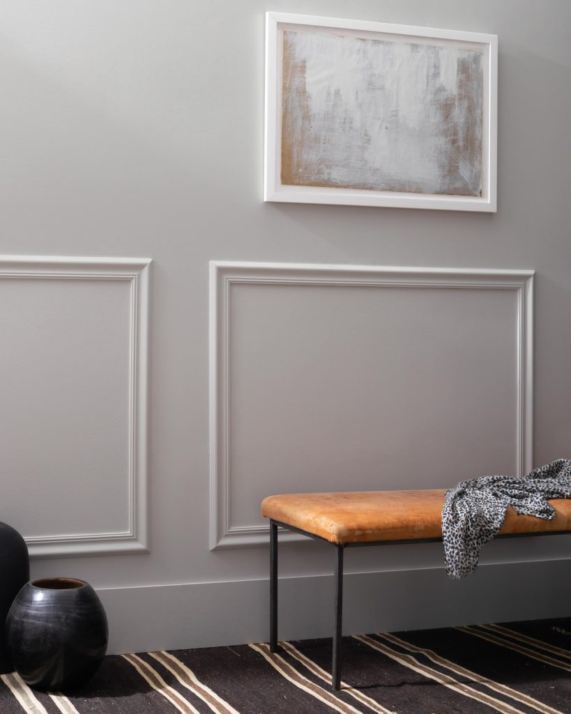
2111-50 Stone Harbour – A classic gray with slightly warm, malleable undertones.
- LRV 43.2
- Collection: Color Preview
This trendy color is a mix between the warmth of CC-394 Boulevard and the cooler 2112-50 Stormy Monday. Stemming from a brown-gray, it captures the warmth from the brown, but predominantly leans towards a gray. This balanced color is also a fantastic medium neutral tone for a transitional style, that merges the browns and grays seamlessly. This violet undertone gray looks grayer under cool lighting, and warmer under warm temperature lighting, like South or West facing areas.
2112-50 Stormy Monday – A classic, straightforward gray that reveals attractive violet undertones in a certain light.
- LRV 40.54
- Collection: Color Preview
As part of the 2017 color trends, this medium tone gray is a sober and modern color for updated styles. The mix of blue and red undertones, gives the impression of a purple undertone gray, but coordinates better with cooler grays and red-undertone browns. Mixing pattern and contrast, makes this color come alive, while layering similar neutrals like whites and lighter grays creates a streamlined and sleek impression.
Enjoy Free Shipping On Orders Over $35, Throughout The US & Canada
Get Benjamin Moore Paints Delivered Right To Your Door.
Shop Now
HC-170 Stonington Gray – An all-purpose silvery gray with relatively neutral undertones.
- LRV 59.36
- Collection: Historical Colors, Colors for Vinyl
Stonington Gray is arguably one of my favorite neutrals. While it undoubtedly falls into the grays, it’s one of the most neutral and true grays Benjamin Moore has, to offer! It’s mix of blue and green undertones, allows for a more natural gray, rather than an exclusively cold gray. While HC-169 Coventry Gray is worth mentioning as a close runner up, it’s certainly darker than the Stonington Gray and typically doesn’t assimilate in dimly lit spaces as well. The HC-170 Stonington Gray pairs well with crisp whites to create a modern impression or warmer whites to soften the grays. Most importantly it coordinates flawlessly with charcoal grays like HC-168 Chelsea Gray or HC-166 Kendall Charcoal.
2121-40 Silver Half Dollar – A light gray buoyed by cool, silvery undertones.
- LRV 56.90
- Collection: Color Preview
While this color could barely be considered a neutral, the strong blue undertones in this color create a fresh and crisp gray that is in trend currently. It coordinates well with contrasting bold colors, and similar tone grays. It may perform better, to cool down a strongly lit Southern or Western exposed area, whereas the same undertone would be intensified in Northern or Eastern exposed spaces. It coordinates well with contrasting bold colors, and similar tone grays.
And that’s a wrap!
After carefully considering the top 10 Benjamin Moore mid-tone neutral colors, it’s safe to say that there are plenty of choices for your home. Goldilocks only had three options to choose from in her story, but there are 10 beautiful and perfectly neutral mid-toned colors to fulfill your own color story! Whether a single room or the entire house, each one of these ten neutrals can easily become a feature that stands out beautifully in anyone’s home. Experiment and see how you can customize your own color story! Let us know your favorite mid-tone neutrals in the comments below, we would love to hear what colors inspire you.

