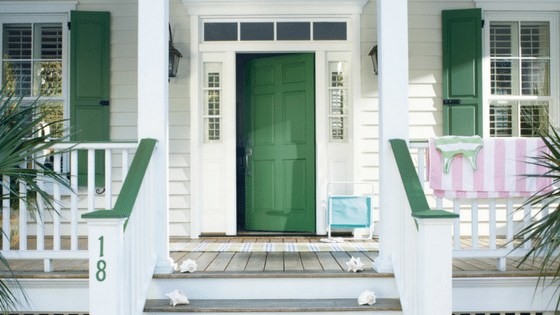
Spring has sprung, which means it’s time to spruce up your exterior spaces. One of the easiest ways to achieve instant curb appeal is to add a pop of personality to your front door. Sharon Grech, Benjamin Moore Colour and Design Expert, shares suggestions for painting your front door.
Embrace Your Inner Style.
The front door is a key focal point of your home, so let your personality shine. “It’s less about the architectural style of the house and more about making a personal statement about your style,” explains Grech. “Like a tie for a man’s suit, your front door can be daring, modern, traditional or classic. Really just have fun with it and make it a reflection of how you want to project your home’s personality.”
Choose a Fabulous Colour.

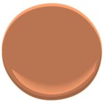
AF-225 Firenze
“Since it’s a relatively small area compared to the rest of the house, you can afford to take risks and try new colours,” recommends Grech. “An interesting trend I’m spotting on front doors is using a pastel colour, like pink, coral or pale blue. This works especially well with a home clad in white or a pale neutral. Coral Spice 2170-40 and Venetian Sky are two of my favourites.” Just remember that dark coloured brick or stone can overwhelm a pale door. For darker coloured homes, choose bold shades. Grech recommends Benjamin Moore Aura Grand Entrance, which is easy to apply and specifically formulated to retain colour integrity and gloss on exterior doors. Let there be light. When selecting a front door colour, it is important to consider natural light. North-facing homes tend to attract cool light, and Grech recommends counter balancing this with warmer colours like Firenze AF-225.

AF-505 Blue Echo
Conversely, for south-facing homes, the light will likely be warm and intense around noon and a mid-tone, such as Blue Echo AF-505, will look great throughout the day. Always view colour selections outside, to see the true effect of exterior lighting. This will help ensure your paint looks fresh throughout the day and rich in the evening.
Whether you decide to be bold with dark colours or prefer lighter hues, Grech suggests earthy tones tend to work well since they are so compatible with the natural elements of the great outdoors.
www.newscanada.com
[gravityform id=”4″ title=”true” description=”true”]


